Colour Psychology in Food Photography
Most people think food photography is about making dishes look “nice”.
In reality, it’s about triggering a psychological response long before someone even considers flavour, ingredients, or price. Colour is one of the fastest routes to that response.
Not because it decorates food, but because it directly influences perception, emotion and appetite at a subconscious level.

Colour is a neurological shortcut to appetite
Before the brain processes what a dish is, it processes how it feels. Colour is one of the first signals it reads.
- Within milliseconds, it starts answering questions like:
- Is this fresh or stale?
- Is this rich or light?
- Is this comforting or unfamiliar?
- Is this worth my attention?
That means colour is not aesthetic. It is behavioural, and it is shaping decisions before conscious thought even begins.
Why the brain reacts so strongly to food colour
- We are biologically wired to associate certain colours with survival cues that have developed over time through both evolution and lived experience, meaning our responses are often automatic rather than learned.
- Warm tones often signal energy and ripeness
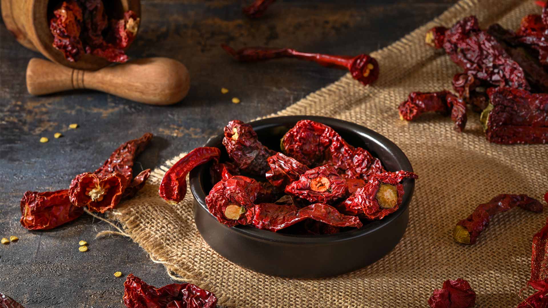
- Deep reds can indicate richness and intensity
- Greens are linked to freshness and vitality
- Muted tones suggest depth, maturity, and tradition
These associations are not learned through branding or marketing. They are deeply ingrained through experience, culture, and evolution, which is why they are so immediate and difficult to override.
This is why colour can make food feel appealing even before context is understood, ingredients are known, or hunger is consciously recognised.
The emotional language of food colour
Colour does not just inform the brain in a logical sense. It influences emotion in a way that directly affects whether something feels desirable, safe, indulgent, or worth paying attention to.
In food photography, this emotional layer is often what converts passive attention into active desire.
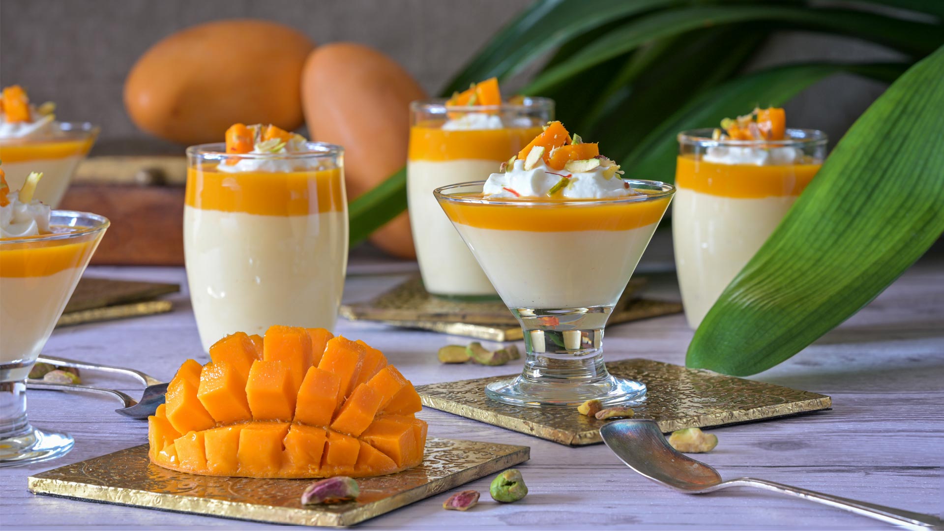
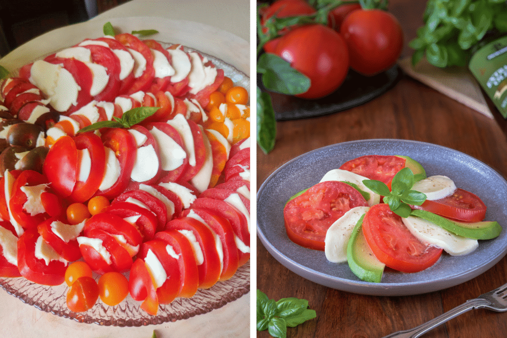
Warm colours (reds, oranges, golds) They stimulate appetite and create a sense of urgency. These tones can increase perceived intensity and richness, making food feel more indulgent, satisfying and immediate in its appeal.
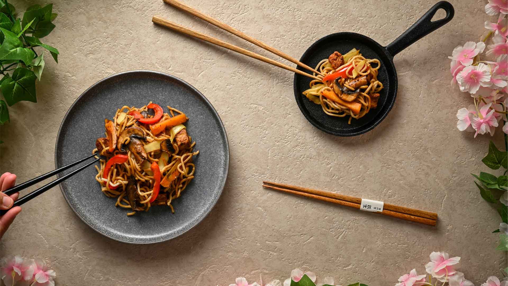
Cool colours (greens, blues, pale tones) These tend to slow the emotional response slightly and can communicate freshness and restraint, although overuse can sometimes reduce perceived indulgence or emotional warmth in the image.
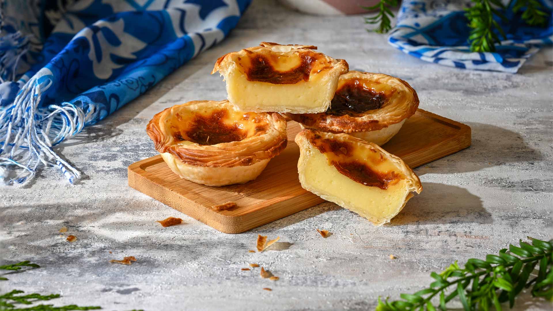
Earth tones (browns, deep ochres, muted neutrals) These create emotional grounding and they often feel authentic, traditional and comforting, which makes them especially powerful for heritage-driven or slow-cooked cuisines.
High contrast and deep shadows These increase perceived premium value, as the brain often interprets depth, contrast and controlled light as indicators of sophistication, exclusivity, and higher quality.

Why colour can change perceived taste
This is where psychology becomes directly commercial, because studies in sensory perception consistently show that people often expect food to taste a certain way based on colour alone, even before they have any physical interaction with it.
That expectation then goes on to influence their actual experience of the food itself, reinforcing the power of visual cues.
So in photography terms:
- A richer red curry looks more intense in flavour
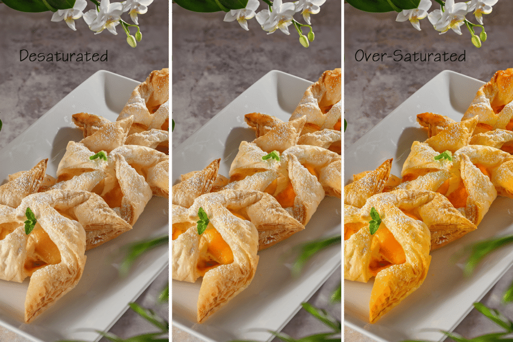
- A pale, desaturated dish may feel underwhelming, even if it is identical in taste and preparation
- Over-saturated colours can feel artificial and reduce trust, even if the image initially grabs attention
This is why inaccurate colour grading can quietly damage conversion rates over time, even when the image appears visually striking or technically well composed.
The hidden problem in modern food imagery
With AI-generated and heavily edited imagery becoming more common, colour has become one of the main points where trust can either be built or broken almost instantly.
Food that looks too perfect or unnaturally polished often loses:
- Authenticity
- Cultural grounding
- Appetite realism
If the colour feels “off”, even slightly, the brain often rejects the image before curiosity has a chance to develop, which means the opportunity for engagement is lost before the viewer is even aware of it.
Why this matters more for Indian and global cuisine brands
Cuisines with rich spice palettes and deep cultural heritage rely heavily on accurate colour storytelling, especially in markets where the viewer may not recognise the dish or fully understand its ingredients at first glance.
A curry is not just brown. A chutney is not just green. A biryani is not just yellow.
Each tone carries meaning that communicates far more than appearance alone:
- Heat
- Spice intensity
- Cooking method
- Cultural authenticity
When colour is handled correctly, it does not simply show food. It communicates heritage, intention and identity in a way that builds trust and desire at the same time.
When it is handled poorly, however, it flattens identity and removes the very cues that make the dish feel real, desirable, and worth exploring.

The commercial reality
Strong colour psychology in food photography leads to:
- Higher perceived freshness
- Stronger emotional response
- Increased desire to order
- Better brand recall
Weak or inconsistent colour leads to hesitation, even when the food itself is exceptional in both quality and execution.
Final thought
People do not make decisions based on logic when they are looking at food, because they respond first on an emotional and sensory level and only then begin to justify what they are seeing.
Colour is what shapes that first response, setting the tone for everything that follows in terms of perception, appetite, and trust.
And in food photography, that first response is often the difference between being scrolled past or being ordered.
If your imagery isn’t creating that immediate sense of appetite and trust, it’s usually not the food that needs changing. It’s the way it’s being seen.

About the Author
Ansuya is a food photographer specialising in Indian and global cuisine.